
mobile app redesign.
Read Your Body is a menstrual cycle charting and tracking app that is highly customizable and accommodating for multiple methods of tracking. Their story is an inspiring one, starting with one woman’s dissatisfaction with existing charting apps. A kick starter campaign, a developer who also charts, and a year of hard work and they had released an app. After a lot of success and dedicated users, a redesign was in order.
A year after the company was launched, they decided the MVP could use some user experience upgrades, and I was brought in early on in the redesign discussions to align stakeholders on a plan to determine the feature roadmap based on user research. After prioritizing some of the user needs, I led the information architecture redesign efforts and worked with the UI designer on plans to update onboarding, data entry, the chart view, and the rest of the app screens. The first design task I tackled was the menu navigation layout.
Timeline
4 weeks
Role
UX Researcher + Designer
Team
Product Manager
Illustration Artist
UI Designer
The app was thrown together without design expertise, and after a year of stoked subscribers, a UX evaluation was desperately needed.
the starting point.
opportunities for improvement.
App is not easy or intuitive to learn.
So many options without organization led to choice overload.
Users didn’t know some options existed because they couldn’t find them.
Accessibility concerns.


the research.
20 Question Survey | 864 Responses
51%
experienced a problem getting started


After analyzing the survey results I created user personas in three different categories:
Olivia, the Super User: dedicated beta testers, early adopters and educators.
Miranda, the Everyday User: comfortable and familiar with charting concepts, color coding, data fields, and their chosen method’s requirements.
Elise, the Novice User: new to charting as well as the app (this is a large portion of our target audience), easily overwhelmed by the amount of info and the complexity to set up.
the personas.
the plan.
My next step was to lead a workshop with the team and senior stakeholders to determine feature prioritization based on user needs.
key priorities.
How might we…
Make set up easier — with half our users struggling on start up, it’s critical to make navigation and discoverability clear!
Simplify adding/editing data.
Make information and language clear and digestible.
the takeaways.

1
Overhaul IA so users can find what they’re looking for.
2
Add onboarding and setup guide to ease initial process.
3+
Redesign Data Input + Chart, incorporate new features, and target new sub-user groups
information architecture.

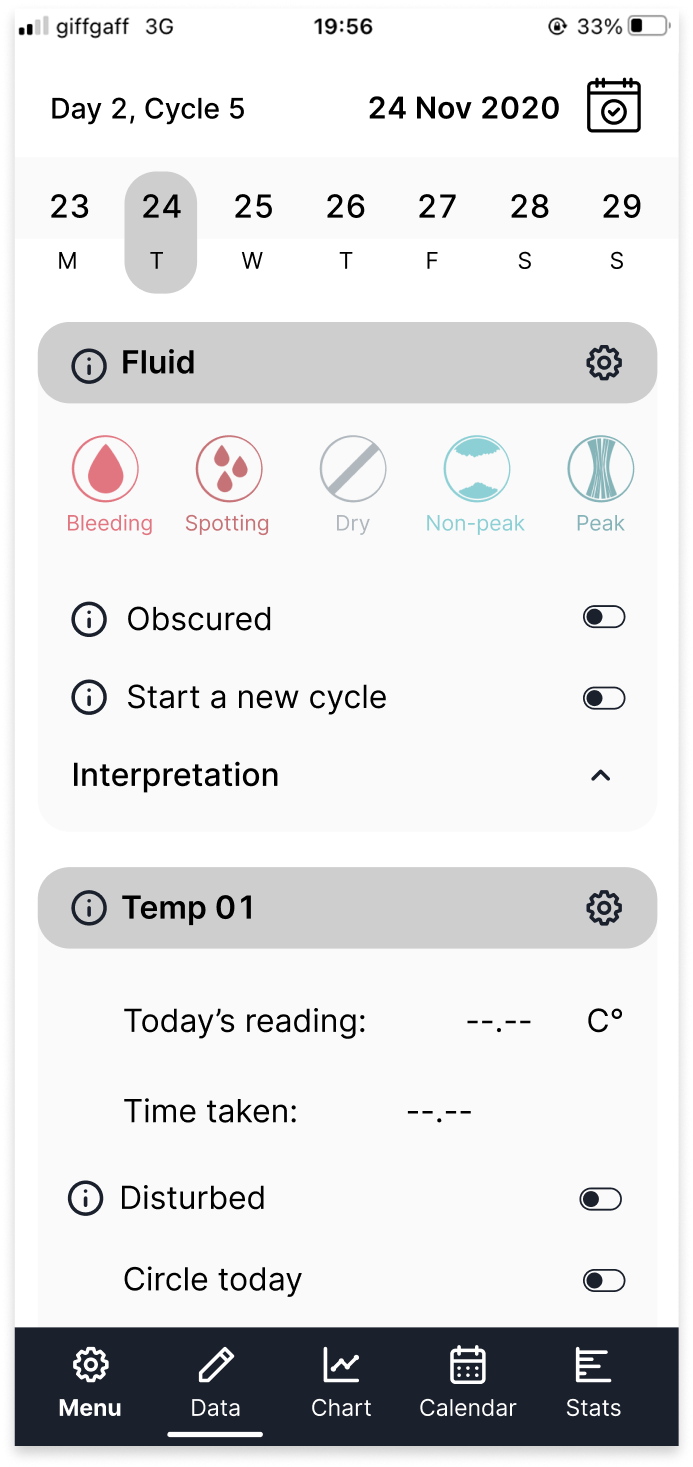
One of the biggest issues we discovered in the research was the confusion around the settings menu. With one long list of options and confusing terminology, users can’t figure out where to edit their settings or upload existing data.
card sorting.
I organized an internal card sorting exercise with the team to get started, while we recruited users to test with. The team grouped most items into four categories.
Data + Chart Settings
Manage Your Data
Info + Support
Manage Your Account
revised settings menu.
Instead of one long list, I broke the content into four main categories that disclose information in a digestible manner, preventing mental fatigue.
Instead of one long list, I broke the content into four main categories that disclose information in a digestible manner, preventing mental fatigue.
revised settings menu.
Original


Revised (low-fi)
low fidelity testing.
12 testers | 3 persona groups
Individual testing sessions with low fidelity prototype.
goals:
Does the labeling resonate?
Are users able to differentiate between tracking items and customizing them?


test results.
When looking for items to track, users navigated quickly to settings, but wavered between chart and data. Some getting lost because data and chart toggle menus look so similar.
When asked to edit fluid settings, many users went out of Settings entirely, and back to the data entry screen.
92%
went straight to Settings to track items! 🎉
75%
associated tracking items with Data… eventually.
83%
spent 2+ seconds deciding between Chart and Data.


breakthrough!
Users’ mental models associate editing data items with where they enter data, NOT where they choose what they’re going to track!
iteration.
Users equated “Items to Track” AND “Items on Chart” so they are no longer two choices at this level.

Users found switching with tabs easy, and clear.

Ability to edit data points directly from the date entry screen.
results + next steps.
Primary Settings Menu items reduced by over 50%.
Reduced cognitive load— erased 2s decision lag during navigation.
Editing data fields: click reduction from 3 to 1.
what’s coming.
Onboarding tutorial including templates for quick and easy setup.
Color adjustments and new schemes for enhanced accessibility.
Chart and Data Entry redesign for enhanced usability.